



The Power of Visual Storytelling in Online Presentations
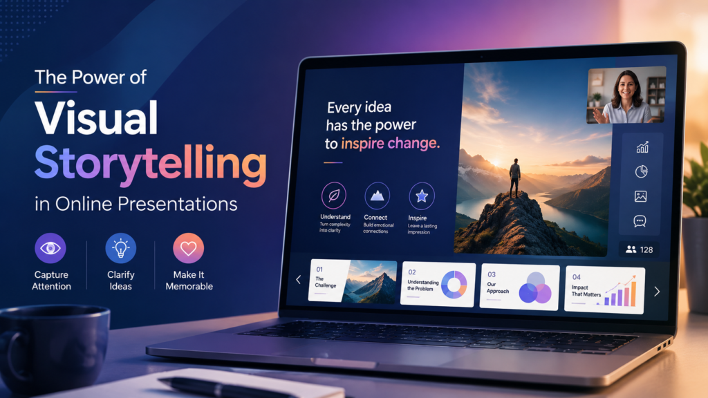
Visual storytelling works in online presentations because it lowers the mental effort needed to understand a message while a screen is already competing for attention. When you pair a clear narrative with the right image, chart, or short clip, viewers process the point faster, remember it longer, and stay engaged through a format that is naturally easier to tune out than an in person talk. This matters more now than ever, since most business communication, from sales pitches to internal training, happens through a screen rather than a room. In this guide you will learn what visual storytelling actually means, why it works on a cognitive level, the specific problems that make online presentations harder than in person ones, and a practical process for building a visual story that holds attention from the first slide to the last.
What Visual Storytelling Actually Means
Visual storytelling is the practice of building a presentation around a narrative arc and using images, charts, video, and layout to carry that story instead of relying on paragraphs of text. It is not the same as adding a stock photo next to a bullet point. A real visual story has three parts working together: a clear point you want the viewer to take away, a sequence that builds toward that point, and visuals chosen because they carry meaning, not decoration.
Think of the difference between two versions of the same slide. One reads “Customer churn dropped 18 percent after we redesigned onboarding,” sitting under a bullet list. The other shows a simple line chart with a labeled drop at the exact month onboarding changed, next to one sentence of context. Both technically deliver the same fact. Only the second one lets the audience see the story instead of having to read it and reconstruct it in their head.
Why Visuals Change How People Remember a Presentation
The case for visual storytelling is not just a preference, it shows up in how memory actually works. A controlled recall study with university students found that graphics improved delayed recall of trends two hours after the material was presented, even though there was no measurable difference in immediate recall between text, tables, and graphics. In plain terms, visuals do not just make information easier to absorb in the moment, they make it stick after the meeting ends, which is exactly when a stakeholder is trying to recall your point in a follow up conversation.
Industry data on presentations points in the same direction. One analysis of presentation statistics found that people typically remember about 70 percent of verbal content three hours after a presentation, but that number rises to roughly 85 percent when the same content is paired with visuals. That gap seems small until you consider how many decisions get made based on what a stakeholder remembers walking out of a call, not what was written on a slide they skimmed once.
None of this means text has no place. It means text should carry precision (numbers, definitions, exact claims) while visuals carry the shape of the idea, the trend, the comparison, the before and after.
The Problem That Is Unique to Online Presentations
Most articles on this topic treat “online” as a minor detail. It is not. Presenting through a screen introduces a specific kind of fatigue that does not exist in a conference room, and it directly affects how much visual complexity your audience can actually absorb.
Stanford researchers studying video call exhaustion identified a concrete, physiological reason virtual meetings drain people faster than in person ones. Communication professor Jeremy Bailenson, founding director of Stanford’s Virtual Human Interaction Lab, examined the psychological consequences of spending hours per day on video chat platforms and found specific, addressable causes for the exhaustion. Constant close up eye contact, seeing your own face on screen, and reduced physical mobility all add cognitive load before your content even starts.
This has a direct design implication: an audience watching a video call already has less attention to spend than one sitting in a room. A crowded slide, a wall of text, or an unnecessarily complex chart costs more in an online presentation than it would in person, because the viewer is starting the slide with less mental reserve. This is one of the clearest and most overlooked applications of visual storytelling in online presentations. Simplifying is not a stylistic choice, it is a response to how tired your specific audience already is by the time your section starts.
Core Elements of an Effective Visual Story
A narrative arc. Every strong presentation has a setup (the problem or context), a turn (what changed or what you found), and a resolution (what to do about it). Slides should map to this arc, not to a list of topics you want to cover.
One idea per slide. If a slide needs two sentences of explanation before the audience understands the visual, the slide is doing too much. Split it.
Purposeful data visualization. Every chart should answer one specific question, not display all available data. A line chart works for trends, a bar chart for comparisons, a simple table for exact figures the audience needs to reference. Decorative 3D effects, extra gridlines, and unnecessary color add what data visualization researchers call chart junk. The data ink ratio principle, developed by statistician Edward Tufte, holds that a large share of the ink or pixels in a graphic should present the actual data, with elements like unnecessary gridlines, meaningless colors, and 3D effects removed because they add no information. In practice, this means before adding a design element to a slide, ask whether removing it would lose any actual information. If not, remove it.
Consistent visual language. Fonts, colors, and icon styles should repeat across the deck so the audience is not re-learning your visual system every few slides.
Motion used sparingly. A short clip or animation can show a process that a static image cannot, but motion for its own sake competes with your narration rather than supporting it.
A Practical Process for Building the Story
- Write the one sentence takeaway first. Before opening a design tool, write down the single sentence you want someone to repeat to a colleague after your presentation. Everything else is built to support that sentence.
- Outline the arc on paper or a simple document. List the sequence of points the way you would tell it to a colleague over coffee, not the way a report is normally structured.
- Storyboard before designing. Sketch each slide as a rough box with a one line note on what it shows. This step catches slides that repeat information or that try to cover too much.
- Match each point to the right visual type. A trend gets a line chart. A comparison gets a bar chart or side by side layout. A process gets a simple flow diagram. A single number that matters gets a big, bold callout with almost nothing else on the slide.
- Design last, and edit down. Once the deck exists, go slide by slide and remove anything that does not serve the one sentence takeaway from step one.
- Rehearse with the visuals live, not with a script read separately from the slides. The point where narration and visual meet is where the story either lands or falls apart.
Where Businesses Are Applying This
Visual storytelling now shows up well beyond marketing decks. Sales teams use before and after visuals to show measurable outcomes rather than describing them. Training teams use scenario based visuals so new hires see a situation rather than reading a policy. Founders pitching a new idea, including the kind of early stage concepts covered in guides on unique business ideas worth starting, rely on a clear visual narrative because investors and early customers are judging the idea in minutes, not paragraphs. Internal reporting has shifted the same way, with dashboards and quarterly reviews replacing dense spreadsheets with a handful of visuals that carry the actual decision points.
AI has also changed how quickly these visuals get built. Tools can now suggest layouts, generate first draft charts, and adapt a deck for a different audience in minutes rather than hours, which mirrors a broader shift already visible in fields like scientific research, where AI is helping people process and interpret large amounts of information faster. The same pattern is showing up in customer facing teams, where AI powered support tools are taking on repetitive explanation work so people can focus on the parts of communication, like storytelling, that still need a human hand.
Common Mistakes That Undercut a Visual Story
Treating visuals as decoration. A stock photo that does not relate to the point on the slide adds visual noise without adding meaning.
Overloading a single slide. Multiple charts, several bullet points, and a large image on one slide forces the audience to choose what to look at, and they often choose wrong.
Inconsistent design across the deck. Switching fonts, colors, or chart styles partway through breaks the visual language the audience has been learning to read.
Skipping the narrative and jumping straight to design. A beautifully designed slide with no place in the story still fails, because design supports a story, it does not replace one.
Ignoring how the platform displays your visuals. A detailed chart that reads fine on a laptop can become unreadable on the small preview window most attendees actually watch during a video call. Always preview at the size your audience will actually see, not the size you designed it at.
Forgetting accessibility. Color alone should never carry meaning, since a portion of any audience has some form of color vision difference. Text needs enough contrast against its background to be readable, and any video should include captions since a meaningful share of virtual meeting attendees watch with sound off. These are basic, well documented accessibility practices, and skipping them quietly excludes part of your audience without you ever knowing it happened.
Choosing the Right Tools for the Job
The tool matters less than the process, but it does matter. Simple presentation software is enough for most business decks. Dedicated data visualization tools are worth the switch once your charts get complex enough that a spreadsheet’s default chart options start distorting the message. Video and screen recording tools matter for teams that repurpose a live presentation into a recorded asset afterward. The same logic that applies to picking the right web platform for a growing business applies here too: pick the simplest tool that does not force a compromise on the outcome, and upgrade only when the current tool is actually the bottleneck.
Once a presentation exists, many teams get more value out of it by repurposing it, turning a recorded webinar into a blog post or a set of social clips, and structuring that follow up content the way any other piece of SEO content gets built, so the ideas from the presentation keep working after the live session ends.
Measuring Whether It Actually Worked
For live sessions, watch engagement signals during the call itself: questions asked, chat activity, and whether attendance holds steady or drops as the session goes on. For recorded presentations, average watch time and the point where viewers drop off tell you exactly which section lost the story. A sharp drop right after a dense slide is rarely a coincidence. For sales and pitch decks, the clearest measure is simple: can the person you presented to repeat your one sentence takeaway back to you a day later. If they can, the visual story did its job.
Frequently Asked Questions
What is the difference between visual storytelling and just adding graphics to slides?
Visual storytelling ties every visual to a specific point in a narrative arc. Adding graphics without a narrative just decorates a slide, it does not help the audience understand or remember the message.
Do online presentations need more visuals than in person ones?
They need more deliberate visuals, not necessarily more of them. Since virtual audiences are working with less attention due to video call fatigue, every visual needs to earn its place rather than adding to the load.
What is the most common mistake beginners make with visual storytelling?
Designing individual slides before outlining the story. This leads to decks that look polished but do not build toward a single clear takeaway.
How many visuals should a presentation include?
There is no fixed number. The right test is whether each visual supports a specific point in the narrative arc. A ten minute presentation might need five purposeful visuals and no more.
Is data visualization part of visual storytelling, or a separate skill?
It is part of the same skill. A chart that follows good data visualization principles, showing one clear comparison or trend without unnecessary decoration, is one of the most effective storytelling tools available in a business presentation.
Do accessibility considerations really affect how well a visual story lands?
Yes. If part of the audience cannot read low contrast text, cannot distinguish a color coded chart, or cannot follow a video without captions, that part of the audience never receives the story at all, regardless of how well it was designed for everyone else.
What is the fastest way to improve a presentation that already exists?
Go through it slide by slide and ask what one sentence each slide is supposed to prove. Any slide where you cannot answer that quickly is a candidate to cut or simplify.
Key Takeaways
Visual storytelling in online presentations works because it reduces the effort a tired, distracted virtual audience has to spend to understand and remember your point. The story comes first, the visuals exist to carry it, and every design choice should be judged by whether it helps or crowds the single takeaway you want to leave behind. Start your next presentation by writing that one sentence before opening any design tool, build the narrative arc around it, and let go of any slide, chart, or graphic that does not directly support it. That discipline, more than any single design trick, is what separates a presentation people remember from one they forget by the next meeting.
