



Mastering Modern Print Patterns: Techniques for Contemporary Design
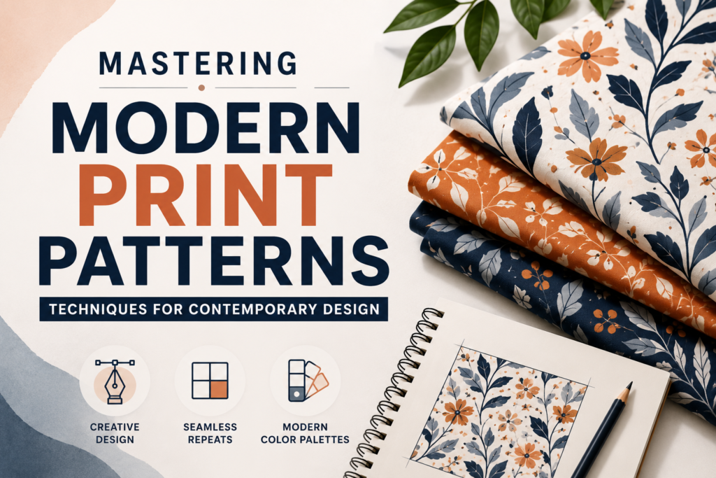
Mastering modern print patterns means combining a solid grasp of repeat structure how a motif tiles across a surface without visible seams with contemporary tools like Adobe Illustrator’s Pattern Options panel, digital color trend data, and print-ready file preparation. It’s the intersection of a centuries-old craft (surface pattern design) and current software, sustainability standards, and production methods. Anyone designing for fabric, wallpaper, packaging, apparel, or digital surfaces needs this skill set, because a pattern that looks good on screen but doesn’t repeat cleanly, doesn’t hold color in production, or doesn’t meet a manufacturer’s file specs will fail before it ever reaches a customer.
This matters more now than it did a decade ago. Print-on-demand platforms, direct-to-garment printing, and small-batch textile manufacturing have lowered the barrier to entry, which means more designers are expected to handle the full pipeline themselves concept, repeat construction, colorway development, and print-ready export without a dedicated production team catching their mistakes.
In this guide, you’ll learn how repeat patterns actually work, which repeat types to use and when, how color and scale decisions affect both aesthetics and manufacturing cost, common technical mistakes that cause failed print runs, and how to prepare files that a printer or manufacturer can use without back-and-forth revisions.
What Is a Print Pattern, and Why Repeat Structure Is the Real Skill
A print pattern is a single design unit called a repeat tile or repeat unit that gets duplicated across a surface to create continuous coverage. The visual interest comes from the motifs (the individual design elements), but the technical skill lies almost entirely in the repeat: making sure the tile’s edges align with its neighbors so the pattern reads as endless rather than as a grid of visible squares.
This is the part beginners consistently underestimate. It’s easy to draw an appealing motif. It’s much harder to make that motif tile seamlessly, because any element that touches one edge of the tile must reappear, correctly aligned, on the opposite edge. Get this wrong and you get a visible seam line — a dead giveaway of amateur work, and something manufacturers will reject outright.
Why This Matters Beyond Aesthetics
A pattern with a flawed repeat isn’t just less attractive it’s frequently unusable. Textile mills, wallpaper printers, and packaging manufacturers work from repeat files with exact, mathematically consistent dimensions. If your tile is 11.98 inches instead of 12 inches, or your motifs don’t line up at the boundary, the file gets kicked back. According to Adobe’s own documentation on repeat patterns, Illustrator’s repeat tools are built specifically so that modifying the original object automatically updates all instances, which is why professional workflows increasingly rely on software-native repeat systems rather than manual copy-paste tiling. For designers who prefer building repeats manually before relying on automation, RetroSupply Co.’s Illustrator pattern tutorial walks through constructing a seamless tile from scratch on a square artboard.
The Main Repeat Types and When to Use Each
There are four repeat structures that cover the vast majority of commercial print pattern work.
Full drop (block) repeat. The tile repeats directly above and beside itself with no offset. This is the simplest structure to execute correctly and works well for geometric patterns, stripes, and grid-based motifs. It’s also the easiest to spot if done poorly, because any misalignment is immediately visible in a straight line.
Half drop repeat. Every other column is shifted down by half the tile height. This is the standard for florals and organic motifs because it breaks up the obvious grid your eye would otherwise detect, creating a more natural, less mechanical feel. Most wallpaper and dress-weight fabric patterns use this structure.
Brick (half-step) repeat. Similar to a half drop, but the offset happens horizontally along rows instead of vertically along columns. Common in patterns meant to mimic masonry, scale, or overlapping textures.
Mirror repeat. The tile flips on its horizontal or vertical axis at each repetition. This works well for symmetrical motifs like damasks or medallion-style designs, where you want a formal, balanced look.
Illustrator’s built-in repeat tools now include a fifth structural option worth knowing: radial repeat, which arranges duplicates in a circular pattern around a center point rather than a rectangular grid — useful for medallion motifs, mandala-style work, and circular product surfaces like plates or round labels. For a deeper technical breakdown of tile types, overlap, and offset controls, Pattern Weaver’s guide to designing repeat patterns is a solid reference.
Step-by-Step: Building a Basic Half-Drop Repeat
- Set up your artboard at the final tile size and correct resolution (300 dpi for most print applications) in CMYK color mode.
- Draw your motifs on separate layers so you can adjust and reposition them independently.
- Position elements that touch the tile edge so their counterparts appear at the exact opposite edge — anything crossing the left boundary must reappear identically on the right.
- Use the software’s built-in pattern preview (Illustrator’s Pattern Options panel or Photoshop’s Pattern Preview) to check the tiling in real time rather than guessing.
- Export a 2×2 or 4×2 tiled proof to visually confirm there are no seams before sending the file anywhere.
Adobe’s Photoshop documentation on Pattern Preview notes that this mode works by having the area outside the canvas automatically repeat the canvas content once enabled, which lets you design directly against a live tiling preview instead of exporting test tiles repeatedly.
Color, Trend Forecasting, and Why Timing Matters
Color is where a lot of pattern work either connects with buyers or falls flat, and it’s more strategically important than most beginners realize. Commercial color decisions aren’t made in isolation — they follow forecasting cycles set by organizations like the Pantone Color Institute’s trend forecasting program, whose annual Color of the Year functions as an industry-wide reference point that influences home design, product style, and color marketing well beyond fashion alone.
What most beginner guides don’t explain is the lead time involved. Forecasting agencies don’t just react to trends — they set them, months or years ahead of retail. According to a design forecasting guide from ColorArchive, Pantone, WGSN, and Coloro typically publish color forecasts 12 to 24 months ahead of retail because manufacturers need that runway for dyeing, ink formulation, and production planning. If you’re designing a pattern intended for commercial textile production, working from last season’s palette can mean your work looks dated before it’s even printed. Printful’s breakdown of Pantone trend predictions and Adobe Express’s overview of Color of the Year trends are both useful for tracking how these forecasts translate into real product palettes.
Practical Color Application
- Build 2–3 colorways of every pattern, not just one. Buyers and manufacturers routinely request alternate colorways, and having them ready as swappable global colors (not manually redrawn) saves significant production time.
- Build on solid color fundamentals the Interaction Design Foundation’s overview of color theory is a helpful refresher on hue, saturation, and harmony if you’re choosing colorways from scratch rather than following a forecast.
- Test patterns at actual scale and viewing distance. A colorway that looks balanced zoomed in on a screen can read completely differently at the size a garment or wallpaper roll will actually be viewed.
- Use global color swatches rather than applying color directly to individual shapes this is the difference between a five-minute colorway change and a two-hour manual rework.
Scale, Motif Density, and Common Beginner Mistakes
Scale is the second most common failure point after repeat structure, and it’s almost entirely about context. A motif that looks perfectly proportioned on a 12-inch digital canvas can look oversized on a garment sleeve or nearly invisible on a large-format wallpaper panel. Designers need to think in terms of the finished product’s physical dimensions, not the working canvas.
Common mistakes worth calling out directly:
- Placing critical motifs too close to the tile edge. Even with software-assisted repeat tools, elements sitting right at the boundary are more prone to visible seams when the file gets rescaled or reformatted for a different product.
- Ignoring negative space. Empty space isn’t wasted space it’s a design decision. Uneven or accidental gaps read as sloppy, while intentional, consistent negative space reads as considered and professional.
- Designing at the wrong resolution. A pattern built at 72 dpi for screen use will look pixelated and soft when printed. Standard practice for textile and paper print is 300 dpi at final size, and this should be set before you start, not fixed after the fact.
- Skipping the tiled proof. Reviewing a single motif in isolation hides seam problems that only become visible once the tile repeats several times across a larger surface.
Sustainability and Production Standards Designers Should Know
Contemporary pattern design doesn’t end at the file it increasingly has to account for how and where a pattern will actually be printed, and buyers are asking harder questions about that process than they used to. The Global Organic Textile Standard (GOTS) has become the leading benchmark for organic and low-impact textile production, and its scope goes beyond raw fiber sourcing. GOTS’s own documentation describes the standard as setting an international common understanding of environmentally friendly production systems and social accountability in the organic textile sector, which includes dyeing and printing processes, not just fiber cultivation.
For designers, this has a practical implication: if a pattern is destined for GOTS-certified production, certain ink types (like discharge printing with aromatic solvents or phthalate-based plastisol inks) may be prohibited outright, which can constrain color mixing and print method choices earlier in the design process than most people expect. It’s worth confirming production standards with a manufacturer before finalizing a palette, not after.
Software Workflow: Building Patterns the Modern Way
Most professional pattern work today happens in Adobe Illustrator, Photoshop, or increasingly AI-assisted design tools, but the underlying repeat logic is identical regardless of software. Illustrator’s native repeat system, introduced to replace the older manual nine-square blending method, lets designers work with radial, grid, or mirror arrangements that update automatically whenever the source object changes a major time savings compared to manually rebuilding a tile every time a motif is adjusted. If you’d rather learn through a structured course, Pattern Design: Breaking Down the Process covers the full workflow from initial sketches to refined vector compositions.
A workflow that scales well for professional output:
- Concept and sketch the motif independently of the repeat structure first, so the design isn’t constrained too early by tiling mechanics.
- Build the repeat tile using the software’s pattern tools rather than manual copy-paste, which introduces alignment errors.
- Preview at scale using a tiled proof or live pattern preview, checking for seams, awkward density clusters, and unintended visual lines (sometimes called “tracking,” where the eye picks up unintended diagonal or vertical patterns across the repeat).
- Develop colorways using global swatches.
- Export print-ready files at the resolution and color mode (CMYK, not RGB) the manufacturer specifies, along with a physical or digital swatch card showing true color.
FAQ
What’s the difference between a pattern and a print?
A pattern refers to the repeating structure and arrangement of motifs across a surface. A print is the final output the pattern as it’s actually reproduced on fabric, paper, or another material. You design a pattern; you produce a print.
What resolution should I use for print pattern files?
300 dpi at final output size is the standard for most textile, wallpaper, and packaging printing. Lower resolutions can work for large-format applications viewed from a distance, but check with your specific manufacturer before finalizing.
Do I need Adobe Illustrator, or can I use other software?
Illustrator and Photoshop are industry standard because of their native pattern and repeat tools, but the underlying principles tile alignment, repeat type, color mode apply in any vector or raster software capable of defining repeatable tiles.
How many colorways should I create per pattern?
Two to three is typical for commercial submissions. Some manufacturers and retailers request more, so building your pattern with global (editable) color swatches from the start makes additional colorways much faster to produce.
Why does my pattern look fine as one tile but show visible seams when repeated?
This almost always means motifs near the tile edge weren’t positioned to reappear correctly on the opposite edge. Use your software’s live pattern preview or a manually tiled proof (at least 2×2) to catch this before finalizing.
Is hand-drawn pattern design still relevant, or is everything digital now?
Hand-drawn and painted motifs are still widely used and often preferred for organic, textural patterns they’re typically scanned or photographed, then vectorized or cleaned up digitally and built into a repeat using the same software tools.
What’s the biggest mistake new pattern designers make?
Underestimating the technical repeat work in favor of the motif design. A beautifully drawn motif with a flawed repeat structure will be rejected by manufacturers, while a simpler motif with a technically clean repeat will print successfully every time.
Do sustainability certifications actually affect design choices?
Yes, in ways that surprise many designers. Standards like GOTS restrict certain ink and dye types, which can limit color and print method options if a pattern is intended for certified organic production. It’s worth clarifying production requirements before finalizing a palette.
Key Takeaways
Modern print pattern design succeeds or fails on repeat structure, not just motif aesthetics a technically clean half-drop or full-drop repeat with a modest design will outperform a stunning motif that doesn’t tile correctly. Color decisions should be informed by forecasting timelines rather than current trends alone, since commercial production often plans 12 to 24 months ahead. Resolution, color mode, and production standards like GOTS need to be considered early in the process, not fixed after the design is “finished.”
If you’re starting your next pattern project, begin by setting your artboard at final size and resolution, build the repeat using your software’s native pattern tools rather than manual tiling, and test with a multi-tile proof before you move on to colorways. That sequence structure first, color second, production specs throughout is what separates patterns that print cleanly from ones that get sent back for revisions
